Visual
Typography
This section lists our only three approved typefaces and how to use them.
Official font families
Our official font families are Glypha and Source Sans Pro. Arial can be used as a substitute in environments where Source Sans Pro and Glypha are not available.
x
![]()

Do
Prioritize legibility.
Mind your medium: Standard type sizes vary based on intended medium (e.g., body copy for print vs. web).
Use black font weights sparingly.
Use Glypha only for display, header, or other larger scale text.
Use Source Sans family for any purpose.
Use provided paragraph styles.
Default to optical kerning.
Default to left-aligned paragraphs.
Default to 0 pt. tracking for body copy.
Default to sentence case.
Align baselines between columns.
Don't
Introduce fonts outside of official font families.
Use italics*.
Set Glypha in all caps.
Use Glypha for body copy or smaller text.
Use excessively small point sizes.
Go below -10pts tracking.
Use wide tracking with lower case.
Use thin or light font weights for smaller text on dark backgrounds.
Use transparency on small text.
Condense, compress, or modify any typeface.
Use ligatures.
*Only use italics when called for by our editorial style.
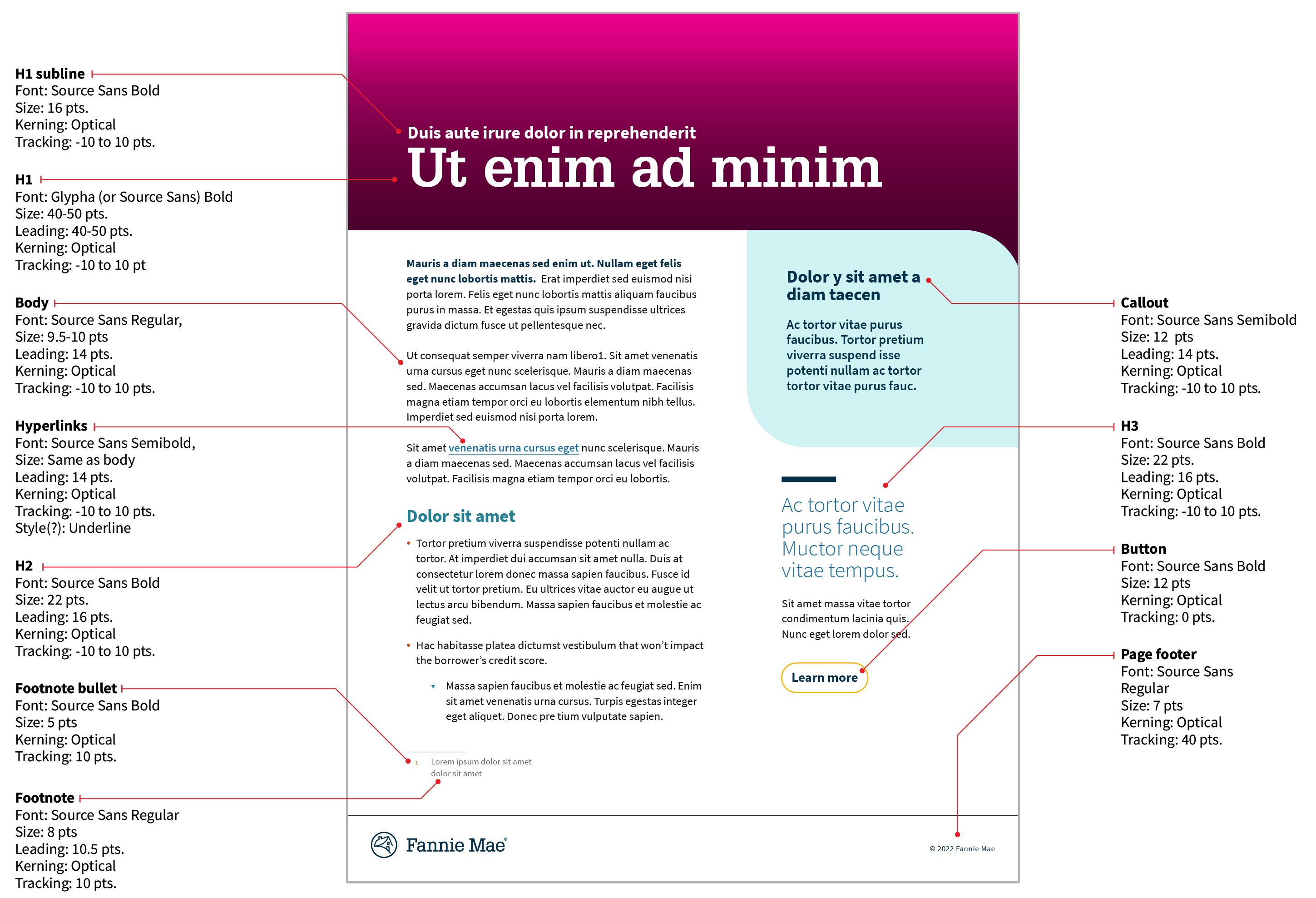
Paragraph styles
Depending on the medium, paragraph styles and hierarchy may differ. Below are InDesign templates with built-in paragraph styles for both single- and multi- page documents. Please visit the accessibility section for further information.
Be creative with display type:
- Explore the different available fonts within the type families for the best design outcome.
- Leverage contrast beyond color: weight, size, upper- vs. lowercase (on a per case basis).
- There is more room for creative solutions within mediums like motion graphics, social graphics, posters, signage, etc.
- Leverage typography to create and maintain brand uniqueness.


