Video
Videography
When creating videos for Fannie Mae, all elements of the brand guidelines apply — make sure to also familiarize yourself and follow the guidance in the photography, illustration, typography, logo use, and color palette sections. Here, you’ll find best practice guidance to ensure that a video aligns with our brand.
Always keep social media requirements in mind when composing shots. You must always be able to crop for vertical or square delivery to various platforms OR shoot additional footage to accommodate this. This applies even if the project’s original use is not intended for social media.
Individuals contributing their likeness, portrait, voice, and/or testimonial to a Fannie Mae video should have signed Fannie Mae’s Model Release and Consent form for Marketing & Communications’ files. If you feature an identifiable property or the interior of a consumer’s home, you should also secure from their occupant (owner or renter, as applicable) a Fannie Mae standard Property Release and Consent Form for Marketing & Communications’ files.
Creative agencies must send all final deliverables, project files, and media assets to Fannie Mae for archiving at the project’s completion. Information on delivery details and required formats are available from your point of contact.
B-roll (people and places)
When shooting original b-roll, we emphasize capturing authentic and realistic footage with natural-looking lighting and balanced composition. Make sure when filming to feature a variety of subjects and highlighted properties.
Do
 Use slow motion when appropriate (we prefer 60 fps – 120 fps range).
- Make the house the hero. Showcase Fannie Mae properties as the character.
- Capture properties and neighborhoods that reflect Fannie Mae’s affordable housing mission.
- Shoot multiple angles as time allows.
- Ensure a variety of demographics for subjects and locations.
Don't
 Capture extreme emotions such as overexuberance or sadness.
- Capture spaces with excessive clutter.
- Feature identifying street names and numbers.
- Feature logos or brands that are not relevant to story line.
- Show any alcohol usage and/or placement.
- Show people working late at night or looking worried or stressed.
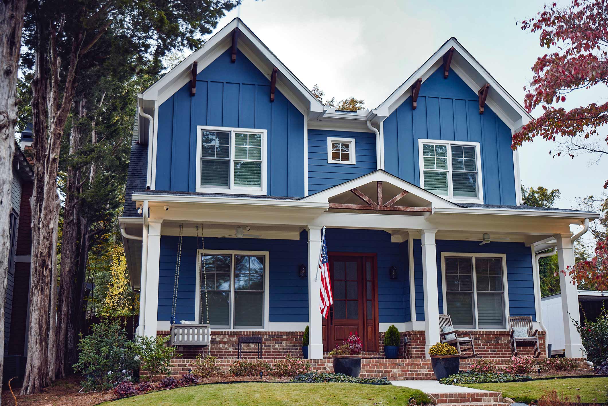
Example 1: Property seems to be within reach
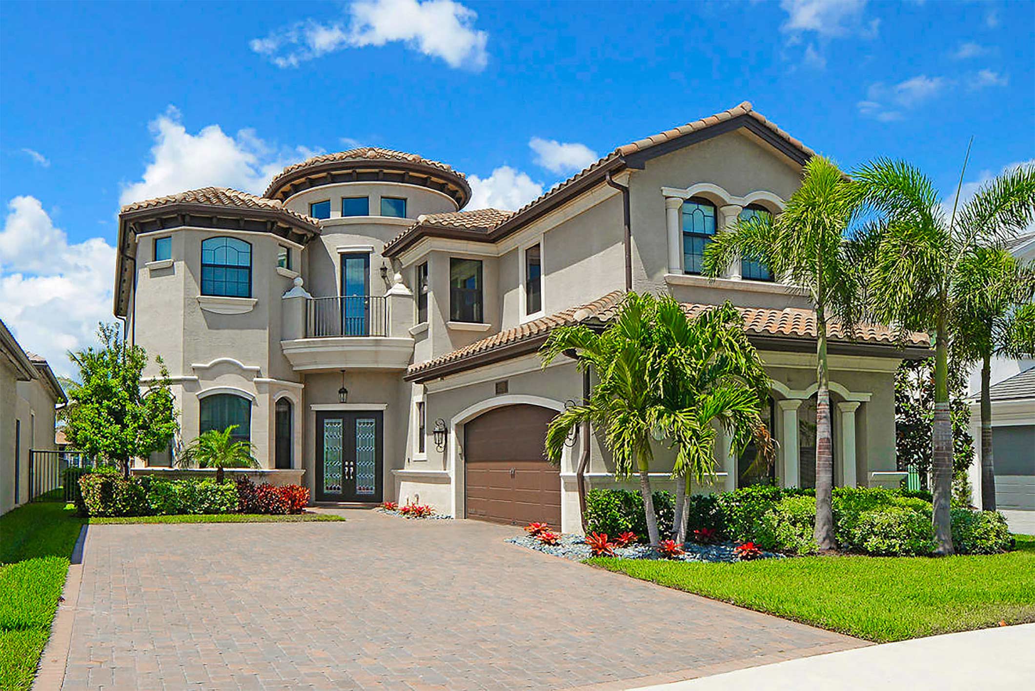
Example 2: Property does not seem within reach
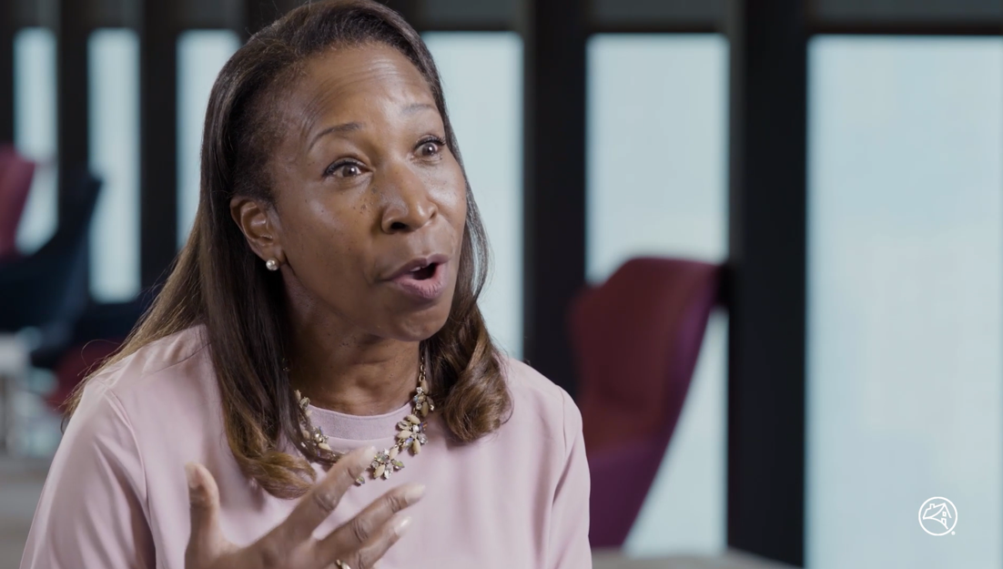
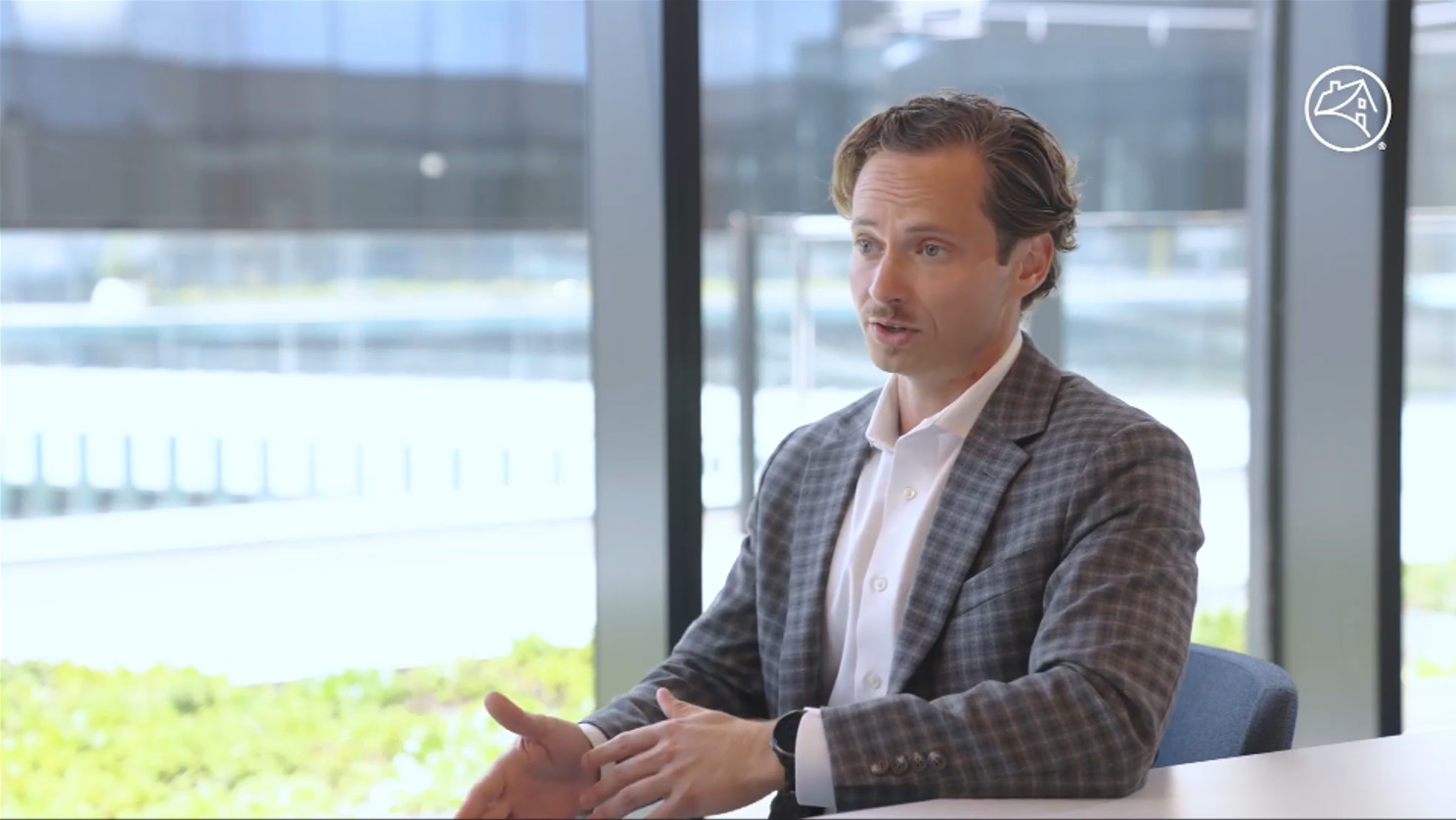
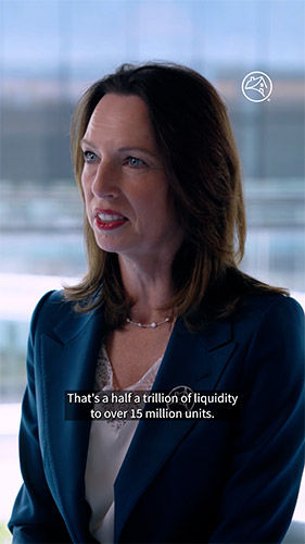
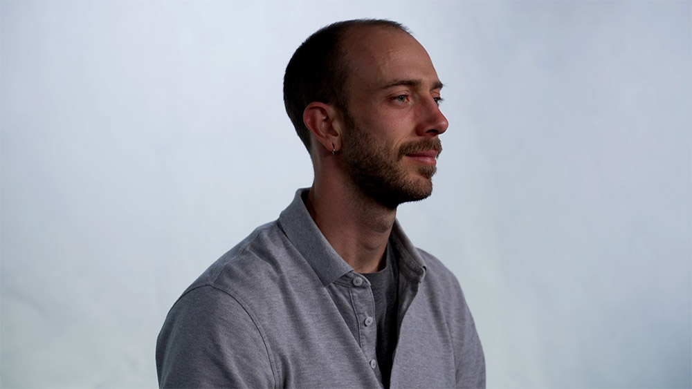
Interviews
We recommend recording interviews on location whenever possible. Subjects may be either standing or sitting in front of practical backgrounds. Please make sure backgrounds are relevant and appropriate to the topic and audience.
Live backgrounds
Do
 Use simple and clean setups.
- Shoot with 2 – 3 cameras for different angles.
- Use depth of field and lighting to separate subject from background.
- Lead the shot and keep lower third graphic space and social media requirements in mind.
Don't
 Capture subject looking straight to camera unless directed in the brief.
- Shoot with a cluttered background.
- Chose extravagant or uncommon spaces.
- Use wardrobe with small prints, glasses with glare, or excessive/noisy accessories.
- Feature prominent photos in the background.
- Feature alcohol usage and/or placement.
Camera A

Camera B
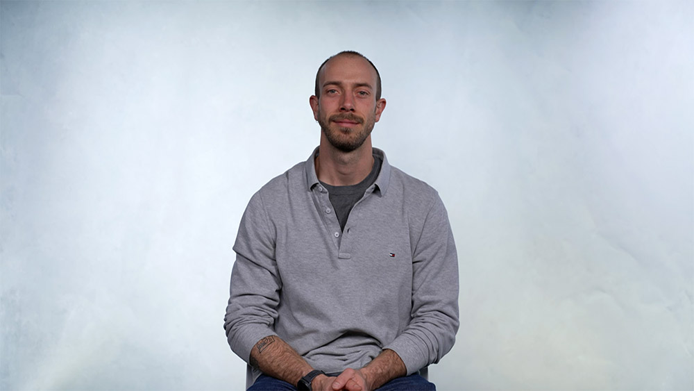
In-studio
If in-studio interviews are part of the project, please keep focus on the subject and be sure to keep the background simple and static. Backdrops or green screen are acceptable when appropriate.
Do
- Choose neutral backgrounds or Fannie Mae-approved image.
- Use green screen if needed. Select the background slate and light the studio to match it appropriately.
- If directed, use teleprompter for a straight-to-camera shot.
- Frame shots with graphics and social media formats in mind.
Don't
- Feature logos or brands that aren’t relevant to story line.
- Shoot primarily in negative space.
- Use chairs that swivel or rock.
- Use overly dramatic lighting.
Camera A
Camera B
Virtual recordings
There may be situations where we need to record virtually. These types of recordings should be used only if there are no other options available.
Do
- Place subject in front of a soft indirect light source.
- Choose a visually appealing, un-cluttered background.
- Place subject in center frame.
- Ensure camera or laptop is on a solid surface at eye level.
- Troubleshoot audio and visual before recording.
- Use a back-up screen-record if recording inside a platform like Teams, Zoom, or Webex.
- Capture reaction shots of all subjects to use in editing process.
- Ask the subject to look into camera and pose as if for a still photo, to use for a video thumbnail.
Don't
- Position subject with a bright light, such as a window, behind or above them.
- Use virtual backgrounds of any kind, including blur filters, unless directed.
- Use messy backgrounds.
- Have more than one person in the shot.
- Position camera below eye level or too high.
- Leave lots of room above their head.
- Feature prominent photos in the background.
- Feature alcohol usage and/or placement.
Behind the scenes (BTS)
To give viewers an inside look at an event or production, shoot behind-the-scenes footage. Filming will most likely take place at events with Fannie Mae employees and guests but could include BTS of on-location shoots.
Do
- Capture a variety of participants.
- Shoot candids.
- Give a high-energy feel.
- Include branded swag.
- Show production elements and event setup.
Don't
- Feature prominent photos in the background.
- Feature people eating or drinking.