Logo

At the heart of our brand identity, you’ll find our logo — the signature for everything Fannie Mae stands for today. Fannie Mae employees receive approval before releasing the Fannie Mae logo or symbol to an external entity via this myservices request form.

Download the full logo and symbol asset pack
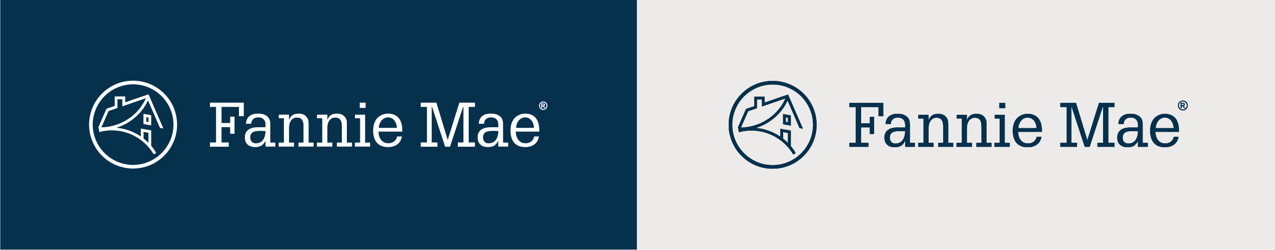
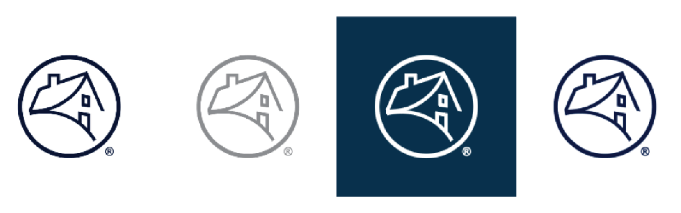
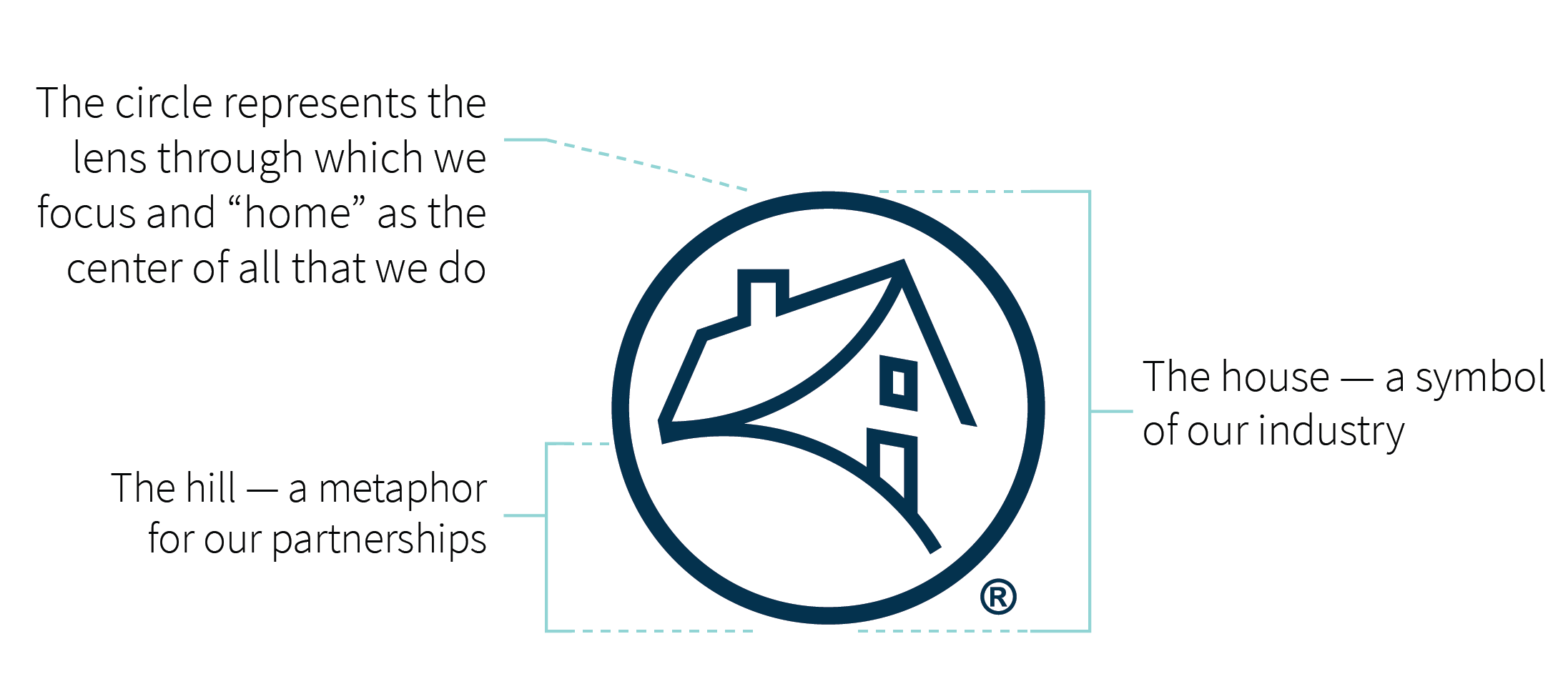
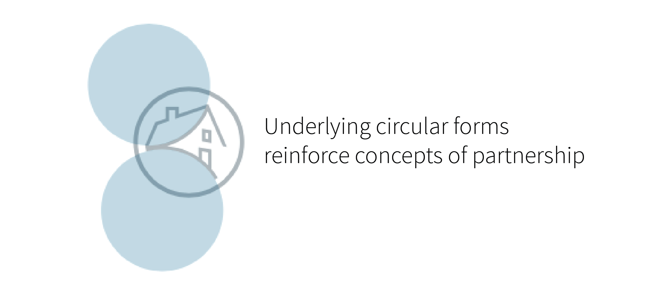
Brand Resource Symbol Description
Fannie Mae symbol

Do

  • checkmarkEnsure that our mark and logo are legible.
  • checkmarkUse the registered trademark [ ® ] for all external publications and signage.
  • checkmarkGive our marks enough space to breathe.
  • checkmarkMake sure they stand out against the background on which they are placed.
  • checkmark
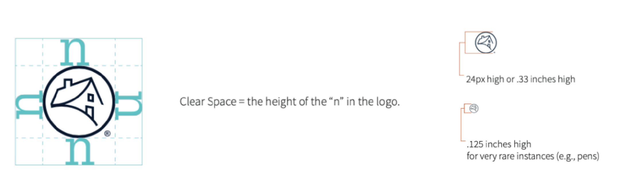
Respect the amount of room required around the symbol and logo.
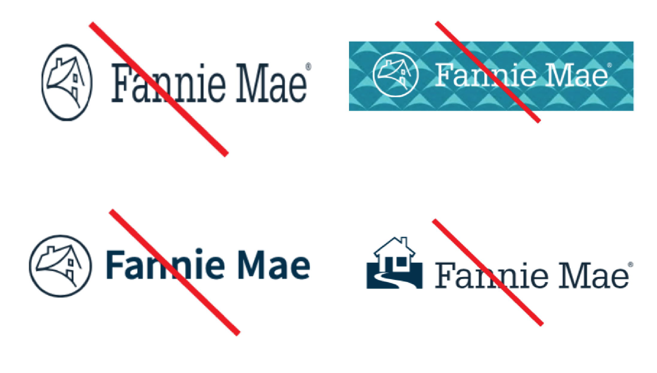
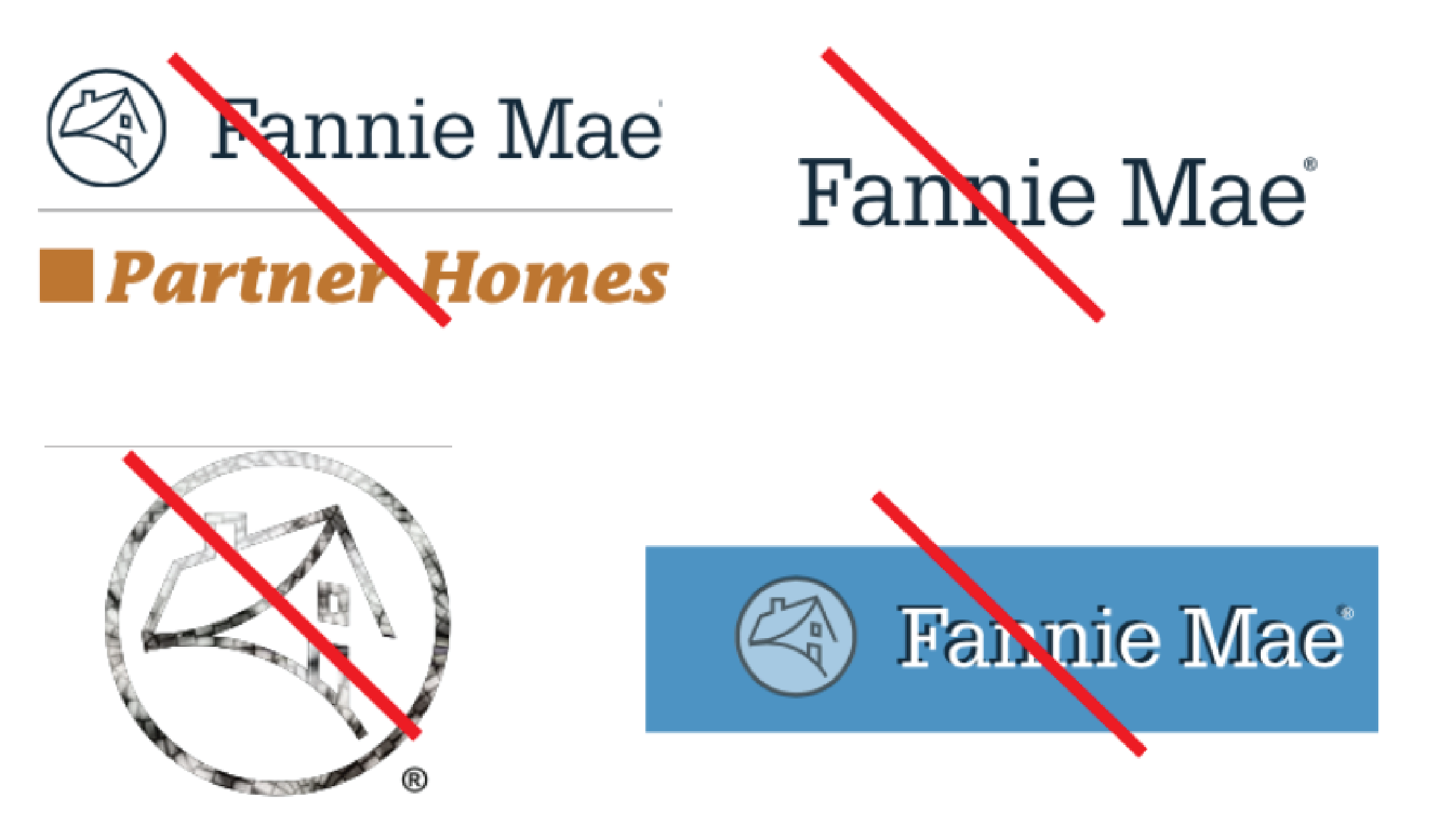
Don't

  • Don't X IconUse unauthorized tag lines or lockups.
  • Don't X IconPlace words or graphics within the clear space of the logo.
  • Don't X IconEmploy imagery within our marks.
  • Don't X IconEmploy the wordmark without the symbol.
  • Don't X IconAlter our marks with color, image, drop shadow, or some other type of effect.
  • Don't X IconStretch, obscure, or alter the integrity of our marks.
  • Don't X IconPlace our marks on distracting backgrounds.
  • Don't X IconAlter our symbol.
Fannie Mae logo do nots

Our logo: Variations, clear space, and minimum sizes

Our logo and symbol are proprietary trademarks of Fannie Mae. While our symbol can be used on its own, our wordmark should never appear without it. Our logo should only appear in Fannie Mae Navy, White, Gray (as a watermark), or Black (in 100% or 60%).

Fannie Mae logo variation

Always ensure that our mark and logo are legible. Never place either below the minimum sizes listed, and make sure they stand out against the background on which they are placed. The minimum height for our logo is 24px or 0.33 inches high and 0.125 inches high for very rare instances (e.g., pens). Please note that the clear area of isolation around the logo shows the minimum amount of room required.

Brand Resource Center Logo Spacing

Our symbol: Variations, clear space, and minimum sizes

Our logo and symbol are proprietary trademarks of Fannie Mae. They should always display clearly and prominently as our signature. While our symbol can be used on its own, our wordmark should never appear without it. Our symbol should only appear in Fannie Mae Navy, White, Gray (as a watermark), or Black (in 100% or 60%). Please continue to retain the integrity of our symbol with this format. Please refrain from cropping the logo in any other way. In some instances, such as very small sizes or on large scale environmentals, a registered symbol may not be necessary. The minimum height for our symbol is 24px or 0.33 inches high and 0.125 inches high for very rare instances (e.g., pens).

Fannie Mae symbol variations
Brand Resource Center Logo Spacing

Logo lockup

For certain situations, our logo and symbol, under management of our Creative Team, may be employed as a lockup to help announce core product, service, and initiatives, as shown. In lockup situations, please adhere to employing a clear area of isolation around the symbol as shown. Please make sure that titles appear in a lighter color than the Fannie Mae logo. All titles should appear in Glypha Light. A lockup is not required for situations where a Fannie Mae logo is clearly displayed with proximity to titles.

Fannie Mae logo lockup