Brand Expression
Events look and strategy
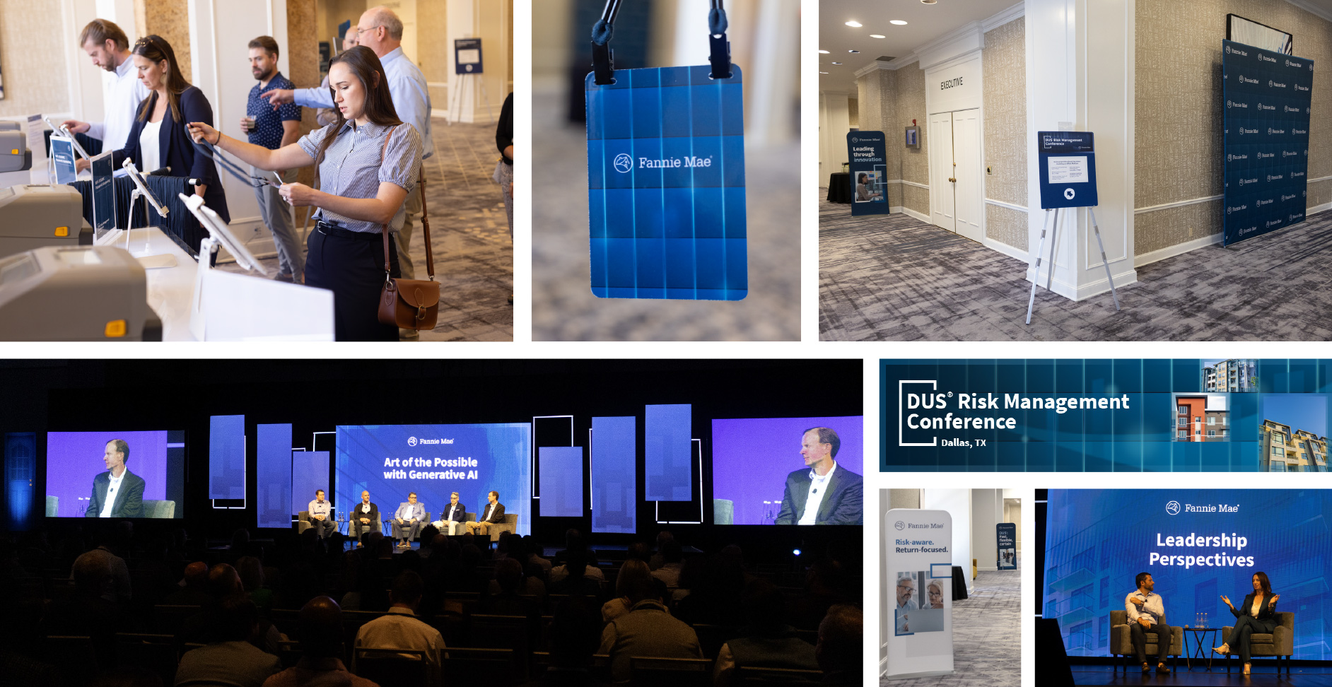
All Fannie Mae events use a single, cohesive concept to tie all events together: The Blue Door.
This standardized approach helps us strengthen our brand identity, optimize resource allocation, and align with strategic business goals. Based on the same look and feel, our suite of visual elements ensures a consistent, recognizable, and impactful presence across all our events.
Characteristics of the Blue Door
- Prominent use of our signature and primary brand colors and logo.
- Door is a memorable brand visual “hook,” ownable by Fannie Mae.
- Visuals and animations of opening door reinforce our tagline.
- As a universally recognized image, the door resonates with all key audiences.
- The outline of a door in the event name lockup (title/logo graphic) reinforces the Blue Door concept and creates visual cohesiveness with other event branding.

Event design best practices
Do
 Use our visual brand guidelines when developing event creative to ensure appropriate use of our logo, colors, typography, and more.
- Use our event name lockup (logo/title combination).
- Establish continuity for recurring events by re-utilizing core components.
Don't
 Create unique event logos
- Use non-brand colors.
- Alter our brand typeface.
- Generate lockups for non-Fannie Mae proprietary events.
Event tiers
We use a three-tier system to classify events, ensuring cohesion and scalability — from the smallest gatherings to our most important and complex presentations.
- Tier 1: High visibility and complexity
- Tier 2: Medium visibility and complexity
- Tier 3: Low visibility and complexity
Marketing determines an event’s tier based on factors like level of effort, priority, and impact — as well as the event’s location and duration, involvement of leadership, and additional support needed. The tier then guides the Marketing teams on specific executions of our event branding.
Event examples